Parent app

the Problem
It was clear that itslearning was not serving the needs of parents in the communities we served. It is hard to function as a full learning management system while an important group of users were being shut out of the experience. We undertook a research project to figure out what the most important needs of parents were.
Research

We spoke with around 70 parents from our markets in the US and Europe. It was clear from speaking with parents was that their biggest concern was “What does my kid need to do tonight?”
The three main problems we identified from speaking with parents all over the US and Europe was that parents did not know what their kids had for homework, how to get in touch with their children’s teachers and if their kids needed help.
Design


Initial designs for the Parent app
The plan was to initially release the app as an MVP. The initial thought was to only show parents upcoming assignments and tests which had deadlines. That idea was proven to be ineffective because it did not reflect how teachers were using the platform. Some teachers do organize their classes with assignments and tests but others use the itslearning calendar or plan tool. The best way to answer the question of “What does my kid need to do tonight?” for everyone was to include them all. The flexibility of itslearning can be an advantage but also a challenge when you’re trying to design a single experience.
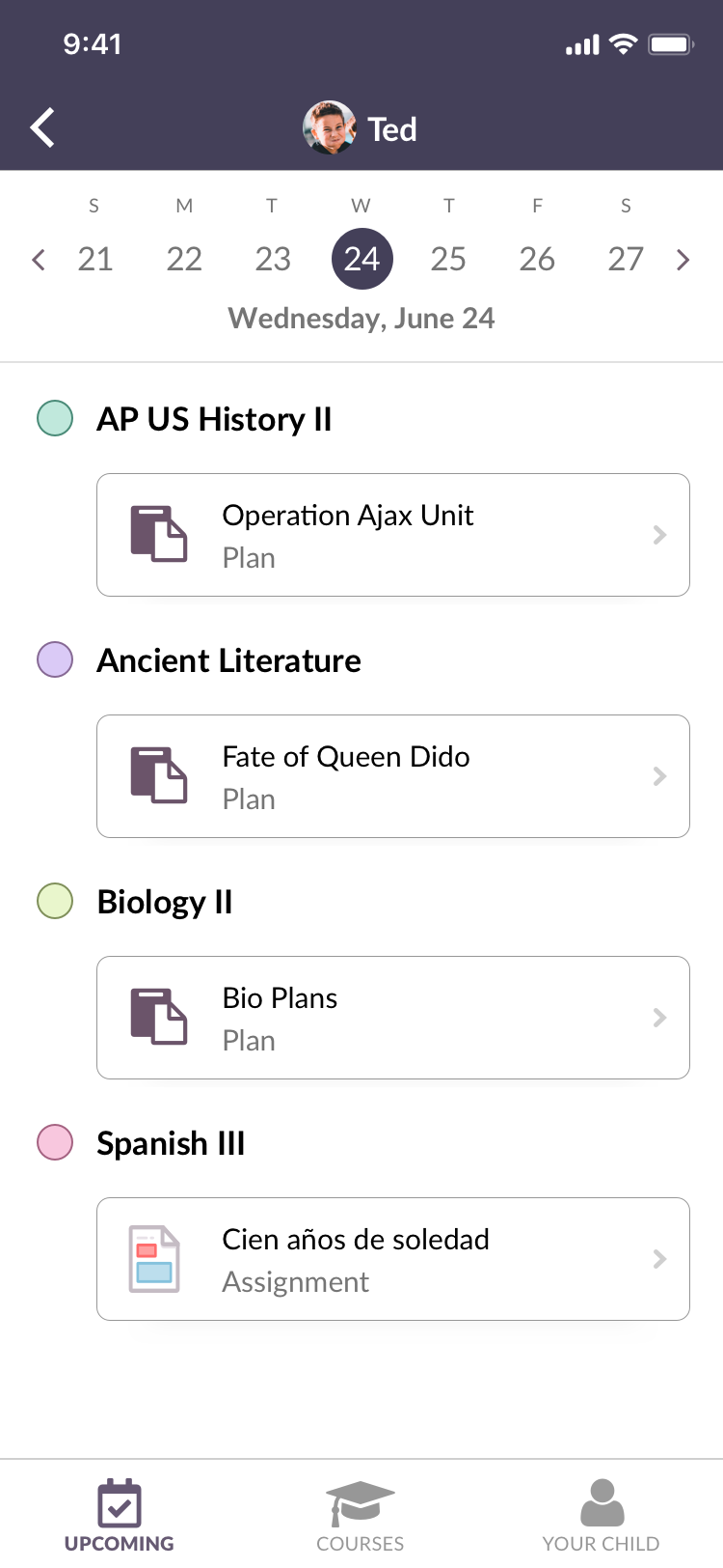

Final designs for the parent app
The other significant challenge was making a cohesive experience for parents who had multiple children. Due to the system architecture, it was not feasible to combine each chlid’s information in one view. We had the landing page take parents to a view where they choose to view one child’s information. The parent can easily switch between students by hitting the back button or swapping children in the top menu.
We conducted usability testing with designs that included the three elements: assignments, calendar events and plans on separate pages. We found from usability testing that often parents would find one or more of these pages completely empty, making it useless and confusing for them. A better solution was to put all three elements on one page.
Participants also noted that viewing a whole week at once felt overwhelming. They wanted to easily see what was coming up but also what their children had done recently. We solved this issue by adding a day calendar so parents could more easily switch from day to day.